She/her
Case study: The custom quote flow
People don't typically love the fact that they have to pay for car insurance, but they may like the fact that they can create the policy they need at the price they prefer...all without having to talk to anyone 🤷🏻♀️
Introducing, the Root custom quote flow.
Content Design | Content Strategy | UX
The problem
Customers did not have a way to customize their car insurance coverages. They had to purchase the plans exactly how they were offered.
Customers like to have control over their coverages, increasing or reducing their coverages to affect their risk and their price. We needed to create a user flow in the Root car insurance app that allowed a customer to customize their coverage options. In the absence of an agent, customers needed to be able to understand our car insurance coverages and make educated decisions about the right coverage for them.
My considerations: Simplify, Clarify, Educate, Guide
-
Make it clear to a customer that they can customize their quote, and why they might want to
-
Reduce confusion and barriers by helping customers understand, in clear terms, what the different coverage options are
-
Provide additional information to reduce the cognitive load and help them make informed decisions
-
Inform them of how far along they are in the quote flow process and motivate them to continue
The Team + Stakeholders
Product design
UX Copy Lead (me!)
Product Designer
Chief Creative Officer
Content Manager
Product
Chief Product Officer
Product Manager
Engineering
Onboarding Engineering Team
Challenges
-
Space: There’s simply limited space on a phone screen
-
Customer knowledge: We had to account for any customer level of car insurance knowledge, including a complete lack thereof
-
Messaging: We had not established how we wanted to speak about and explain coverages from a content design perspective...and there’s a lot of jargon in insurance
-
Direct insurance: No agents to help guide. It’s just you and your phone. And Google.
-
Limited resources: This was still in the leaner early years of the company
-
Quick timeline: Leadership wanted it pretty darn quickly. MVP.
Here's what we did
Early exploration
Some early exploration for our custom quote flow: What could this look like? How do we fit all of the information a customer may need on a phone screen? How do we make it digestible and approachable?


Competitive analysis
We started by doing a competitive analysis. Most insurance companies had web experiences, but most did not have an app experience for purchasing insurance. Lemonade was one of the few insurance companies that did, and they used a very distinctive and recognizable bot. That was their thing. We were going in a different direction.
How we made it clear that you could customize your quote, and why you might want to
-
We added a section to the quote screen informing customers of the option to customize their quote, and why they might choose to. The goal of the copy was to inform the customer and empower them with choice. We conducted user testing to learn what type of messaging would be most compelling—testing the notion of guiding or helping customers versus giving them control. Giving them control won out. We then used one of our recommended plans as a base for the customer to work from.


WINNER!
How we made the information approachable, digestible, and helpful:
-
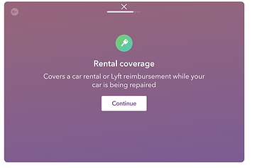
I broke our coverages up into sections with contextual screens to make them more digestible and provide useful information about the coverages a customer is about to see. These screens also inform the customer where they are in the flow and encourage them to continue.
-
I provided clear, easy to understand explanations of our coverages that eliminate jargon while staying legally compliant.
-
We provided descriptions that made it clear how much a different level of coverage would affect the price with the "Add" and "Save" copy.
-
Where applicable, I provided additional “Good to know” information to help in the decision making process.
Some of the screens from the custom quote flow:

Entry point with the winning copy
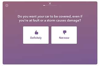
Contextual screens that prepare you for what's next, provide information on the types of coverages, and let you know how far you are in the process


Simple, clear, and legally compliant explanations of the coverage

Helpful descriptions that let you know how different options will affect your price
Additional content design exploration:
I also wanted to explore a different way of approaching choosing your coverages altogether. How do you make the process easier, more approachable, and personalized for customers, and have it feel more like a conversation in the absence of an agent? I explored a question and answer format, where based on a customer's answer, we would be able to let them know if a coverage might be right for them.
Whiteboarding exploration:


And a more polished, finalized Lucidchart that was socialized showing the flow of questions we would ask, and the paths a user would take based on their answers:


This was out of scope for the app at the time, but marketing was interested in using it on the coverages landing page on the website. As a result, the marketing team used this approach to create a quiz, providing users with a list of coverages they should consider based on their answers.
Some screens from the quiz:


The results
-
Within 2 weeks of launch, the new app custom quote flow resulted in a statistically significant increase in binds
-
We established contextual screens and status bars/context as integral to our content design for Root Insurance products to help customers understand and navigate the app
-
Based on usability studies, the original custom flow and content remains our custom in-app quote flow experience 3 years later
-
We established a framework for copy across the company as to how we explain and break down complex coverages
-
Visitors to the website coverages page who took the quiz continued into the flow and created a profile at a higher rate than those who did not (+5.3%)